Favorite Captured P.O.D
- Feb 21, 2017
- 1 min read

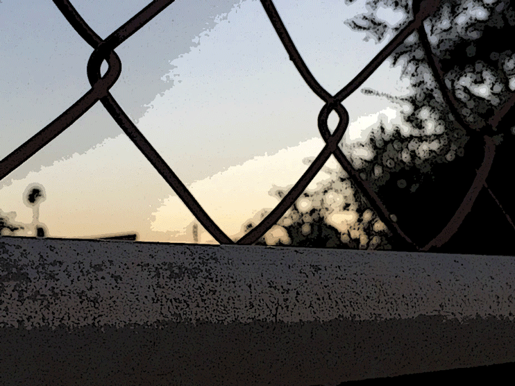
This is my favorite edit I made from the principle of design assignment. This was the photo I used for the contrast example, then I converted it into a a GIF with four individual edits done to each copy. For each copy, I made some minor changes to the brightness a, luminosity, and color balance. Ten I applied a filter over the image, which drastically changed its appearance. The contrast between the colors is clearly seen in the edits, from blue, to a light gold. to utter darkness. I love each and every one of them.


Comments