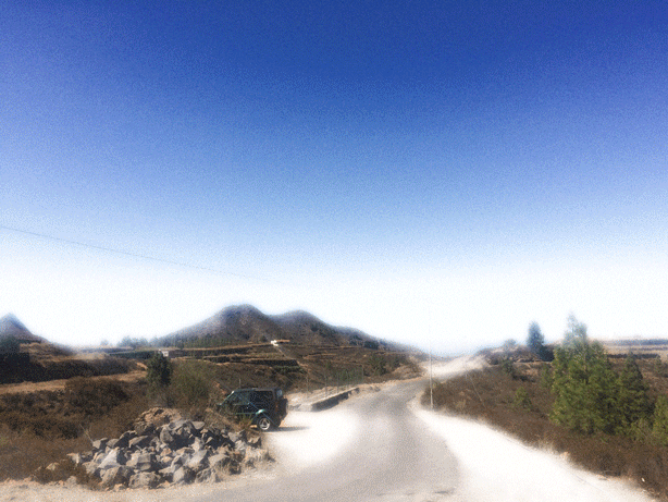
My First Five 7/22/16
 |  |
|---|---|
 |  |
 |

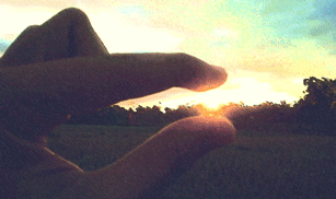
Weekend Photos 7/25/16
 |  |
|---|---|
 |  |
 |
7/26/2016 - My Unique Images
 |  |
|---|---|
 |  |
 |
Before and After Photo Edit 7/27/16


Photo Edit Description:Using Adobe Illustrator CS6 I first began by image traced the photograph, and then made the image 16 colors, thus creating a sense of movement as well as making the colors seem more darkened, and cartoonish.
7/28/16 Photos
 |  |
|---|---|
 |  |
 |

Before

After
Photo Edit Description:First i exported the onriginal image to Adobe Illustrator CS6, after i traced the image, and then changed and set the preset to shades of gray, giving a black and white look to the original image.
Website Evaluation

Self Evaluation: With the outcome of my website so far, I would grade myself a B+ as I have completed and submitted all photography assignements and have updated it regulary. However, I really need to work on making the website more appealing as bto attract more attenttion as well as makuing it more interesting.Like i said, the resuklt of my website from 2 weeks of work, looks pretty well.
Documentary Photography-Event: Exploring San Diego
 |  |
|---|---|
 |  |
 |  |
 |  |
 |  |

Before

After
Photo Edit Description: This image was edited in Photoshop CS6, fist I increased the overall brighteness of the opriginal image, and then i stylized the image by giving it a film grain filter, giving the image a more antique film camera type look.
8/2/16 - Landscape

Taken by Manuel Juarez

Taken by Manuel Juarez

Taken by Manuel Juarez
Taken by Manuel Juarez

Before

After
Photo Edit Description: Using Illustrator CS6, i edited the image first by lowering the brightness and increasing the contrast of the first image significantly. After, I modified the colors making them look like different shades of gray. As a result, this gives the image a dark black and white appearance.
8/3/16 - Longshot & Extreme Longshot Photos
 |  |
|---|---|
 |  |
 |


Before
After
Photo Edit Description: This image was modified using photoshop, the first thing I did was back lighting the photo, this gave the original image a slight glow to it. After I made a gradient overlay above the image by combininng the colors red, orange, and yellow. As a result it gave the lanscape a very warm panorama view.
8/4/16 - Cityscape Photos
 |  |
|---|---|
 |  |
 |

Before

After
Photo Edit Description: Using photoshop, I modified the image first, by increasing the saturation of the image as well as the contrast. After, I gave the image a cooling filter, which made the image look more alive, better lit, and a better balance of color.
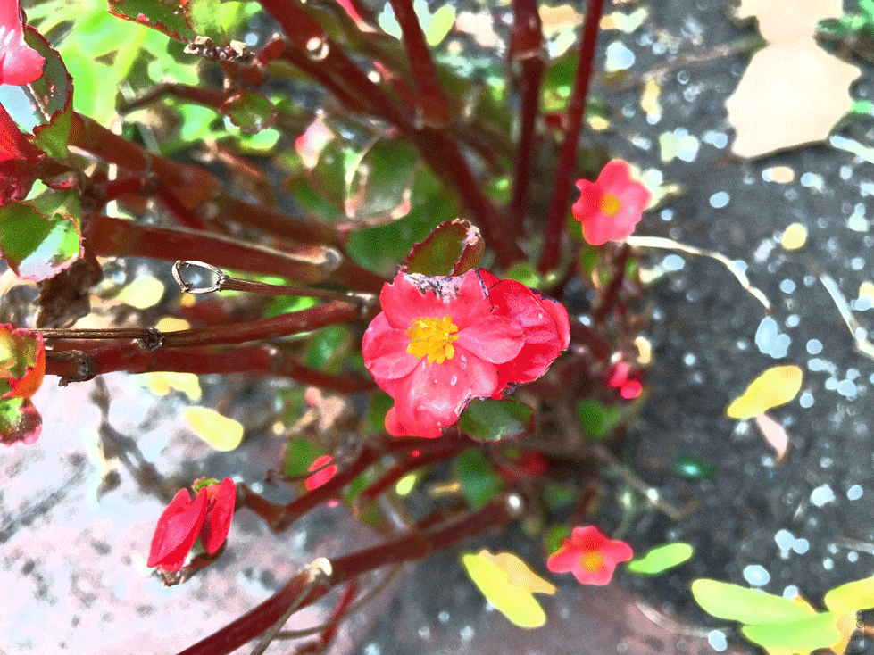
8/5/16 Close Up Photos
 |  |
|---|---|
 |  |
 |

Before

After
Photo Edit Description: This image was edited and modified using Adobe Illustrator, the first modification I made to the image was by image tracing it, which originally traces the original image in black. To give it some color, I then increased the fidelity of the traced image, which gave the original image a sort of painting look to it.
8/8/16 - Photo Recreation Baby Pictures

Taken by Manuel Juarez

Taken by Manuel Juarez

Taken by Manuel Juarez
Taken by Manuel Juarez


Before
After
Photo Edit Description: Using Photoshop I lowered the opacity of the original image and darkened all the color from the original image, which makes it look as the photo were taken many years before.
8/9/16 - Photo Recreation: Before and After

2002

2016
Photo Edit Description: The first image was taken by my mom back in 2002 when I was two years old. The second image was taken fourteen years later, at the age of fifteen. Judging from the two images I still have similar feature from when I was two years old.
8/10/16 - Creative Images On Angles
 |  |
|---|---|
 |  |
 |  |

Before

After
Photo Edit Description: With photoshop I was able to edit the brightness and contrast of the original image. The end result was a photo that looks as iof it were taken at nighttime, but i assure you that it is the same image.
8/11/16 - Elements of Art
 |  |
|---|---|
 |  |
 |  |

Before

After
Photo Edit Description: Using Adogbe Illustratior I stylized the image by giving the image a craquelure filter, making the image have a cracked and oil painting appearance.
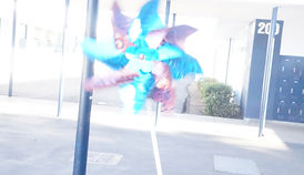
8/12/16 - My Favorite Elements
 |
|---|
 |
 |
 |
 |
 |

Before
After
Photo Edit Description: In this edit, I made a GIF containing four modified edits of the same picture using Photoshop CS6. For these four edits I used a series of filters including plastic wrap, and glowing light.
8/15/16 - Golden Light
 |  |
|---|---|
 |  |
 |

Before
After
Phot Edit Description: Using Photoshop I made a GIF of the original image, now consisting of four consecutive modified edits that repeat forever. These images were modified using by changing the brightness of each image and then adding a image filter to each one.
8/16/16 - Golden Light Directed At Object
 |  |
|---|---|
 |  |
 |

Before

After
Photo Edit Description: Using Photoshop I first fliped the image upside down. Then I traced a couple of patterns using the liquify tool, which stretched the image and made it look like the colors had been washed out. After, I Gave the image a oil paint filter, and this was the result.
8/22/16 - Portrait Images
 |  |
|---|---|
 |  |
 |

Before

After
Photo Edit Description: This photo was edited using Photoshop. First I used the text tool to spell out Purple Haze, then I placed the text horizontally left alligned. After I added some color to the, and also gave them a dark purple stroke. After, I gave the original image a ink outline filter.
8/23/16 - Text Practice 8/26/16 - Project


Final Portait Project Reflection Reflection: The inspiration for my magazine cover came from a tutorial I had completed for a digital art class. The same elements I borrowed from them were the layered background style, and the text color. After, I added myown personal touches by adding myself to the cover, creating a edited/warped title, and I added some things about myself as well as a quote that I go by. The quote describes how it can never hurt to attempt spmething, even though you fail, at least you took the opportunity instead of never tyring at all. This style overall describes myself well as I am well centered, balanced, and mishievious. Decicated to Harambe.
8/29/16 - Portrait: Studio Photography
Fig 5-2. By looking away from the camera, the subject creates an emoptional aspect of deep concentration, seriosness, as well as a sense of sadness.
Fig 5-3. The high contrast of the image and composition contribute to the cooks emotionless way of expression and the overall seeriousness of his stance. There is also almost a feeling of fear affiliated with the image.
Fig 5-4. By seperating the photograph into tiles, the photographer creates better balance because of the equal amount of color and composition in each cube. Therefore it would look better if the image were seperated into cubes than just by itself.
Fig 5-5. The photographers use of high brightness in the portrait expresses happiness, the darker clothes as well as the gray backgroyund also emphasize the subjects face.
Fig 5-6. The tiltewd angle creates unity among the three subjects being photographed and emphasizes happiness from being together.
8/30/16 - Portrait Images on Studio Photography
 Garden Portrait |
|---|
 Family Tree |
 Designer |
 Sunset Trees |
 Majestic Canine |


Photo Edit Description: Using Photoshop to edit this image I was able to unsaturate the bright colors in the background, decrease the brightness, and then I darkened the greens. Now, the overall mood of the image has changed to a more serious tone.
8/31/16 - Rule of Thirds Applied

Before Applying Rule of Thirds
This image is just a raw portrait photograph with a natural background. However it doesn't demonstrate the the rule of thirds.

After Applying Rule of Thirds
Now that the image has been modefied the focal point has changed from the center, to the right and left hand corners.

After Applying Rule of Thirds
Since I wanted to emphasize the dogs face, I made grids and placed the face in the center of the first row.
9/7/16 - Portraits With Composition
 Luke |  Shadow Portrait |
|---|---|
 Cedric |  Jay |
 Hallway |

Photo Edit Description: Using Photoshop I made a GIF of a portrait I took of a friend. The GIF contains four edits in which I gave filters that drastically changed the balance and mood of the original image. However, the focal point remains the same.
09/08/16- Symmetrical - Asymmetrical - Radial Balance

This image taken in Yosemite, shows symmetrical balance from the lakes reflection of the coastline and tress.

This image clearly exemplifies asymmetrical balance as there is no symmetry and there is no balance of flowers being centered into frame.

This image of colored pencils is an example of radial balance as it's based on a circular pattern of organized and aligned colored pencils.

Before
After
Photo Edit Description: This image was transformed into a GIF format, each ogff the four edits shows significant changes in color saturation, bruighteness, and their contrast.
9/13/16- Scale & Perspective
 |  |
|---|---|
 |  |
 |

Before

After
Photo Edit Description: Using Photoshop as the editing software, I was able to modify the priginal image's vibrance, color balance, and exposure. As a result the edited image looks as if it were taken at night.
Mood and Story Photography


Before

After
Photo Edit Description: Using Photoshop again., I filtered the original image with a plastic wrap. Therefore, the image looks almost like a oil painting.
9/15/16 - Digital Photogram Design


Photo Edit Desxcription: Using Photoshop CS6, I was able edit the color balance of the original image as well as the color curve. As a result, the original image has been transformed into a phtopgram piece of art.
9/16/16 - Basic Aesthetics in Photography

The lines from the building guide the viewers eyes from the very bottom to the the top of the building.

Because the main focal point of the image is placed on the left corner, the image looks more organized and better coordinated.

The geometrical patterns in this image almost serve the same purpose as the leading lines as they provide a foundation and guide for the flow of the image.

The people in this photo are organized well enough that the viewer can distinguish how many there are, as well as locating the images points of interest.

Now that the image is not centered or centered aligned, the image shows more complexity and makes the image more entertaining to look at.
10/5/16 - My Name: Photographic Art


This is a bicycle rack in the street in the form of an M due to its curved shape.
This is the outside of a small cabin like room that creates the shape of an A viewed from the front.
This is a sort of towel hanger in the shape of a lower case N.
This is basically a small couch chair that I took a picture of backwards to make it look like a U.
For some reason wix made the original image very dark, but it used to be a bench in the form of an E.
Nothing special here, just my hand in the form of an L.
10/6/16 - Real World Photography Projects

10/10/2016 - Digital Color Correcting

Before
Original image without any edits made on it, raw photo.

After
Now that color has been added to the photo, the portrait now looks more alive and rejuvenated.
10/24/16 - Education & Career PowerPoint

11/03/16 - Aperture Priority

ISO 100
Shutter Speed 1/640
Aperture F 3.5
The first photograph was taken with aperture of f/ 3.5, and as you can see the image is very out of focus, along with the background, but the cup was in focus. This was the result of a really small aperture, with little light let into the camera.

ISO 100
Shutter Speed 1/100
Aperture F 9
The second photograph was taken using a aperture of f/ 9, with a more clearer focus on the background, and the image is less blurry around the cup, as more light was used.

ISO 500
Shutter Speed 1/60
Aperture F 22
The third photograph had a vastly higher aperture of f/ 22. Now the image has a very large depth of filed, and the details of the background are much more recognizable than the first image.
11/07/2016 - Shutter Speed Prioity


1/800
1/250
1/125
As you can see the first photograph taken with a shutter speed of 1/800, shows the most amount of brightness and blur out of all the three photos. The object pictured is also not very clear, and you are unable to tell what it really is.
The second photograph was taken with a lower shutter speed of 1/250. Now, the moving object is significantly more clearer, as is somewhat more recognizable than the first photograph. The brightness also decreased as well.
The third and last image is the best one, taken with a somewhat lower shutter of 1/125. This photograph is crystal clear, and the moving object is clearly seen, without any blurriness or extreme brightness.
1/125
11/09/16 - ISO Priority

200
This photograph of the spring was taken with an ISO of 200. Therefore, the image is not very blurry, or has any signs of grain and static.

800
The second image was taken with an ISO of 800. Compared to the first image, this one begins to show little but noticeable change in the light sensitivity including the quality of the image.

16000
The last image with an ISO of 16,000, compared to the other pictures shows considerable change in the resolution of the image, as well as add more electronic noise to the image.
11/17/16 - Relationship Between Aperture, Shutter Speed and ISO

Aperture: F / 25
Shutter Speed: 1 / 1250
ISO - 1280
In this image, all the setting were changed manually. The ISO, shutter speed, and aperture are present. The shutter speed of 1/1250 was able to capture the book flipping in the air, it did such a good job that even the title and cover can be easily read, The high ISO made the area around the book very fuzzy and grainy.Aperture remained mainly low, allowing little light to affect the quality of the image.
11/29/16 - Correcting Defects, Blemishes and Wrinkles

Original Image

The second image was edited using the camera raw tools. There has been some decrease in wrinkles and higher background lighting.

The last image is the final edit in Photoshop. Now that the image has been significantly edited, Clint now has had a significant loss in wrinkles, imperfections, and is looking as young as ever.
11/30/16 - Restore Aged Image

Before

After
Photo Edit Description: This was probably the hardest edit I've done so far on Photoshop yet. Using the spot healing tool, stamp tool, and patch tool I was able get rid of the rips and smudges on the image, replace the corners, and restructure the ripped faces. The patch tool did the most help, as it replaced the ripped parts of the photograph with untouched, cleaner parts.
12/5/16 - Adobe Practice
