
1/10 Best Photos National Geographic

"Can the Selfie Generation Unplug and Get Into Parks?".Taken by Corey Arnold.October 2016

"How Can 6 Million Acres at Denali Still Not Be Enough?".Taken by Aaron Huey.February 2016

"How the Greeks Changed the Idea of the Afterlife".Taken by Vincent J. Musi.July 2016
"Can the Selfie Generation Unplug and Get Into Parks?".Taken by Corey Arnold.October 2016

1/17 - Photography Lighting Term Chart

1/19 - Relationships in Lighting Terms

1/23/17 - Captured Lighting Images


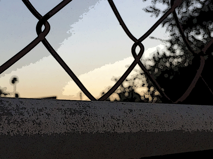
Magic Hour Lighting
These two images were taken in Sunset Cliffs, which is located in Point Loma in southern California. The pictures were taken during December 8 of the past year at the verge of sundown. Because I took it at that time of the day I was able to capture the very strong colors that magic light is known for making, especially the strong gold, blue and orange tints. Overall, the two images portray a very relaxed and humble mood since the colors are very relaxing and their is little going on in the picture besides the peaceful splashing of the waves against the shore.


Over & Under Exposure
This series of photos containing under and over exposure were taken in November of the past year. Due to the increase or decrease of the ISO and light exposure, the photos changed dramatically. When the ISO was increased the photo became very bright, as the amount of let in was increased as well. When the ISO was decreased, and the amount of light let in was decreased, the photo became very dark, bu the object photographed still remained visible. The object is the most visible and appealing when the ISO in the halfway mark, as pictured
1/25/17 - Natural and Studio Light

Studio Light Colored Image
This photograph was taken using only studio light, and has not had any edits done to it. It incorporates the rule of thirds since the subject photographed is not centered, but instead placed on the right hand side of the frame, making it more appealing to the eye. The image contains little to non shadows, but does contain back light.

Natural Light Colored Image
This photograph represents a perfect example of natural light. In fact, I prefer this type of lighting over any type of studio photography.Like the presentation stated, I used the shade to my advantage as it provided a nice shine of soft light for the subject being photographed. However, this type of lighting did create more shadows compared to using studio lighting.

Studio Light Black & White Image
The second photograph, was edited using Photoshop, and was converted from a colored image to a black and white version. The back light that was the primary source of light, created a nice stream of soft light that really helped balance the white in the edit. The shadows from the clothes and other sources were brightened up by increasing the luminosity and contrast, making the black and white edit seem brighter and more natural.

Natural Light Black & White Image
Above, I transformed the natural light image into a black and white edit on Photoshop.Compared to the studio light black and white image, the whites in this one are way brighter along with the darker colors such as the grays and what once were the cyan's. Because this photo was taken under natural light, the photo looks more illuminated as well as the much softer compared to the studio light.
1/27/17 - Camera Setting Chart

1. What did you know about the chart already?
From previous lessons, I had already learned of the effects of aperture, ISO, and shutter speed on a photograph. These factors are also very crucial when taking pictures with a DSLR camera since it can affect with your intended results.
2. What did you need to review when the power -point was presented?
The only thing I felt l;like I needed to review was the order in which the photos changed, whether decreasing or increasing a camera setting would lead to what.
3. Overall outcome of chart when you created it?
I'm pretty sure, that I got the correct order, and made no mistakes in the chart.


2/6/17 - Product Advertisement

In this project, I made an advertisement for the Coca Cola Company, where I showcased the beverage being used. As Coca Cola is such a widely recognized company, this advertisement would be targeted to the general public, being showcased on television, magazines, or even street billboards. In the ad I wanted to make coca cola a family product, shown in a normal family home, and all its simplicity. In photoshop, I added a variety of effects to emphasize the logo including adding embossing, inner/drop/outer shadow as well as a stroke to surround the logo since the Coca Cola color palette only consists of red and white. I added some text in a similar font to that of the logo, and added outer glow to emphasize them. Overall the purpose of this ad, was to make Coca Cola as consumer friendly as it can possibly be.
2/15/17 - Principles of Design Through My Lens
 Balance |  Contrast |
|---|---|
 Unity |  Pattern |
GIF Description
In this edit, I converted the example photo I used for contrast into a GIF containing four edits. For each edit I made some minor changes to brightness and vibrancy, after that I applied a filter over that edit. Each frame,still continues to demonstrate the contrast of the photos color palette, as the colors begin from a faded blue, to a soft gold color. Compared to the original photo, this edit gives off a mood of tranquility.

Principals of Design EDIT
The second edit I made was with the photo I used for unity. In Photoshop, I was able to change the color balance which darkened and made the original color palette more unsaturated. As a result, the photo looks as if it were taken at a later point in the day.In addition, the mood the image portrays is that of relaxation.
2/23/17 - Painting with Light Masterpiece

In my very first attempt at light painting I decided to use a popular text based slogan as my painting. I chose this theme, and a white light, since white is a peaceful color, and it symbolizes goodness, and possibility which is very associated with the text that I wrote. The style I used was pretty simple, not very extravagant, and I did make my presence known in the photo. In addition, the bright white against the dark blue, almost black, background deeply emphasizes the written text and creates a strong contrast. However, I could have added more, mostly patriotic, since the message does have to do with American nationalism.
2/28/17 - Me in History

Original Image

My Face Edited Into History
This is a photograph of Albert Einstein, the famous physicist who coined the equation E=mc^2, created the theory of relativity, and helped make significant advancements towards the subject of quantum theory. I chose Albert Einstein as my historical figure because he is so widely recognized throughout the world, and he is truly am inspiration for many aspiring physicists, scientists, and engineers worldwide. The original image was a regular portrait of Albert facing the camera, taking place during the early 1940's. At this time Einstein was a major figure since he contributed enormously to the creation of the atomic bomb that would later be detonated on Hiroshima, just five years later.. However he passed a way a decade later, unable to finish his unified field theory.
3/06/17 - Take a Vacation

I chose the location of Chichen Itza in Yucatan, Mexico as my location since it is very culture rich, and houses a large amount of beautiful Mayan architecture. Since I have never gone before, I've only seen pictures online of this place The tremendous amount of culture that has been presents here from generation to generation is amazing and intrigues me a lot. However, with photoshop, I was able to make my dream come true. Along with me, I inserted a couple of Mayan people, which really makes it look more realistic. One appears to be performing a ceremony, while the other holds an umbrella for me. Overall, I had a lot of fun placing myself in the place I want to be the most.
3/10/17 - HDR Photography at its BEST

Exposures 1/1600,1/800,1/400,1/200,1/120
ISO 800
Aperture F16
This image above, was my first attempt at HDR photography. To compose an HDR photo, I took five photos of the same background, but with different exposures for each one. Once I took the photos I placed them all in a folder, inputted them into Photoshop, and combined them all together into one photo. Once combined, I edited it by increasing the saturation, contrast, exposure, and added vibrancy to the edit. Once I did that, I opened the HDR as a camera raw so it could continue further editing the photo. After I opened the image as a camera raw I edited mostly the luminosity and highlights or shadows. In the end I got the image shown above. Now, the colors are much more saturated, the shadows are more deeply emphasized, and the definition has thoroughly been increased.
3/17/17 - Self Illustration Portrait Sketch


In this project I created a self illustration sketch of myself using Photoshop, whilst also decorating it further with a background and some color. Due to a mistake with the brush preset while sketching the image, I was unable to fully add color to myself since the paint bucket filled the entire image instead of a specific portion or feature of my face or body. However, I was able to improve the sketch somewhat as I was able to add a background. Since blue and white are one of my favorite colors, I made a gradient background, which really emphasizes the ketch to look well done, even though it may not be colored in the way I wanted to color it. In the end, The i really like how the final project turned out, and it gives a mood of art and creation.
4/5/17 - Candid Moment with Caption

This took place during lunch at Mr. Helle's room where he debated Gilbert over the news following the health care act
This took place during lunch at Mr. Helle's room where he debated Gilbert over the news following the health care act
4/19/17 - Designing A Business Project

4/28/17 - My Face from a Book

I decided to use this book mainly because of the color match between Brent and the book and I believe Mao Zedong is an integral figure in history.

Since John Lennon is one of my favorite artist and quote possibly the best of the twentieth century, I decided to use this book and pay an homage to the great Beatle.

I decided to use this book as well to honor the great African American heroes that have revolutionized society and receive little credit over their accomplishments.
I decided to use this book mainly because of the color match between Brent and the book and I believe Mao Zedong is an integral figure in history.
5/3/17 - Me in My Childhood
 |
|---|
5/8/17 - My Photo Realism
 |  |
|---|---|
 |  |
 |  |
Photo Edit: In this image I implemented several distinct objects to create an example of photo realism using only Photoshop as my tool. I incorporated a backdrop from San Francisco's Golden Gate Bridge, and gave it the lighting that was derived from a picture taken of the galaxy. I also added a planet to the background to create a more unrealistic appearance. Next, I added two freedom birds that seek to lift a giant can of Coca Cola from the dock. This image has no real meaning or message to convey, it just represents an example of how ones imagination can create such intricate ideas.
Photoshop CS6 Adobe Training May 23-26
